Why Every Jersey Business Needs Responsive Website Design
November 14, 2024
Think about this: Over 60% of all web traffic now comes from mobile devices. If your site isn’t optimised for different screens, you’re missing out on a massive chunk of potential clients—who will leave as quickly as they arrive. Your website isn’t just a digital brochure; it’s the front door to your business. And if it’s not responsive, that door might as well be locked.
Here’s the thing: Your customers don’t sit at a desktop all day. They’re browsing on phones, tablets, and laptops of all sizes. In Jersey’s competitive market, a responsive website isn’t a luxury; it’s a necessity. Let’s dive into why it matters and what you need to do about it.
What Is Responsive Website Design?
Responsive design means your website adapts seamlessly to any device—whether it’s a smartphone, tablet, or desktop. No more pinching and zooming. No more awkward side-scrolling. A responsive site automatically adjusts its layout, images, and text so that it’s easy to read and navigate no matter the screen size.
1. User Experience Is Everything
A clunky, hard-to-navigate website can turn visitors away faster than you can say “bounce rate.” In fact, 57% of users say they won’t recommend a business with a poorly designed mobile site. If your site doesn’t provide a smooth experience on every device, you’re leaving money on the table.
Actionable Tip:
Test your site on multiple devices and screen sizes. Use tools like Google’s Mobile-Friendly Test to get a quick snapshot of how your site performs on mobile. If it’s not up to scratch, it’s time for a redesign.
2. SEO Loves Responsive Design
Here’s a fact that might surprise you: Google prioritizes mobile-first indexing. This means it looks at the mobile version of your site first when deciding where to rank you. If your website isn’t responsive, you’re losing out on valuable search visibility.
Actionable Tip:
Check your Google Analytics. Are your mobile bounce rates higher than desktop? If so, it’s a sign that your mobile experience isn’t cutting it. A responsive redesign could help boost your rankings and attract more traffic.
3. Build Trust and Credibility
In Jersey, where business reputation is everything, your website needs to make a solid first impression. A poorly formatted site that looks great on desktop but breaks on mobile screams “outdated” and “unprofessional.” High-value clients won’t stick around for that.
Actionable Tip:
Run a quick usability test with friends or colleagues on different devices. Ask them to complete a simple task, like finding contact information or viewing a service page. If they struggle, so will your clients.
4. Increase Your Conversion Rates
You could have the most beautifully designed website in the world, but if it doesn’t work on mobile, your conversion rates will tank. Mobile users are often ready to take action—whether it’s signing up for a newsletter, booking an appointment, or making a purchase. Don’t make it hard for them.
Actionable Tip:
Look at your conversion data split by device type. If mobile conversions are significantly lower than desktop, it’s a clear sign your site isn’t optimized. A responsive design can help bridge that gap and boost your sales.
5. Adapt to Changing User Behaviour
The way people browse the web is constantly evolving. In the past year alone, mobile browsing has seen a sharp rise, while desktop usage continues to decline. Your website needs to be flexible enough to adapt to these shifts.
Actionable Tip:
Stay ahead of the trend by investing in a responsive design that can handle whatever new device comes next. This future-proofs your site and saves you from costly overhauls down the road.
6. Maximise Your Marketing Efforts
Every dollar you spend on digital marketing should be driving results. But if your landing pages don’t look good on mobile, you’re wasting money. A responsive site ensures that your ads, emails, and social media links drive users to a seamless experience, increasing the chances they’ll stick around.
Actionable Tip:
Before launching a new campaign, check how your landing pages perform on mobile. If they’re not responsive, tweak the design or layout before pushing traffic there.
7. Stand Out in a Crowded Market
In a place like Jersey, where everyone knows everyone, word-of-mouth and reputation matter. Having a sleek, responsive website can set you apart from competitors who are still using outdated designs. It signals that your business is modern, reliable, and client-focused.
Actionable Tip:
Audit your competitors’ websites. Are they mobile-friendly? If not, this is your chance to shine by offering a better user experience.
It’s Time to Go Responsive
A responsive website is no longer a nice-to-have; it’s a must-have. It’s about more than just looking good on every device—it’s about providing an exceptional experience that turns visitors into loyal clients. In Jersey’s fast-paced market, where clients expect quality and efficiency, a responsive website is your secret weapon.
If your site isn’t performing on mobile, you’re missing out on potential clients every day. Don’t let an outdated design hold you back. Let’s create a responsive site that sets your brand apart and drives real growth.
Want my checklist for building a powerful responsive site? Get in touch for my free PDF

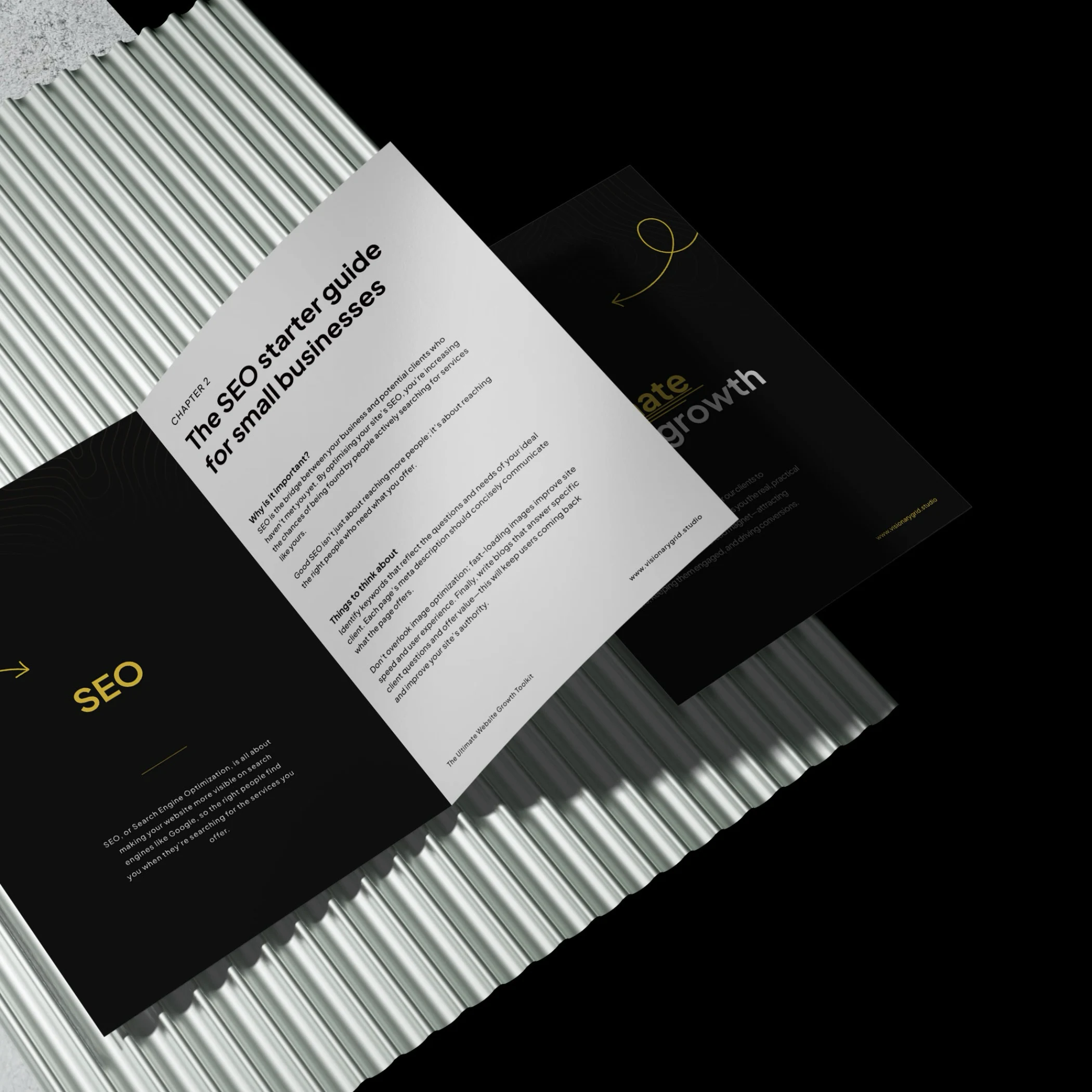
Grab our PDF toolkit to transform your website into a client magnet
Are visitors coming to your site but leaving too soon? This toolkit has everything you need to make your website a client-generating powerhouse, from boosting visibility on Google to creating an experience that keeps visitors engaged and ready to take action.
Inside, you’ll get insights on:
- Improving SEO so clients find you first
- Designing a smooth user experience to reduce drop-offs
- Crafting clear, engaging messages that build trust
Is your website costing you investors & customers?
Submit your site for a free Startup Website Stress Test.
We'll personally review your site and send you a 5-minute video breakdown of what’s working, what’s broken, and how to fix it—so you don’t lose opportunities.