Top 5 website mistakes (I often see!) and how you can fix them.
June 13, 2024
Let's face it, there's a lot of bad websites out there. I see them all the time. A lot of businesses don't realise just how much it could be costing them. Here are the top five mistakes to avoid and how to fix them to ensure your website performs like a champ and should stop you losing money!
1. Poor Navigation
Why It’s Bad: Complicated or confusing navigation frustrates users, causing them to leave your site quickly. This increases your bounce rate and negatively impacts your search engine rankings.
How to Fix It:
- Simplify your menus: Limit your primary navigation to 5-7 items.
- Use descriptive labels: Make sure menu items are clearly labelled and intuitive.
- Breadcrumbs: Implement breadcrumbs so users can easily trace their steps.
2. Slow Load Times
Why It’s Bad: Users expect fast-loading websites. If your site takes more than 3 seconds to load, you could lose up to a whopping 40% of your visitors.
How to Fix It:
- Optimise your site images: Compress images without losing quality.
- Use browser caching: Enable caching to reduce loading times for repeat visitors.
- Minimise HTTP Requests: Reduce the number of elements on your page.
3. Not working on mobile!
Why It’s Bad: Feels fairly self-explanatory, but I see this all the time. Over 50% of web traffic comes from mobile devices. If your website isn’t mobile-friendly, you’re likely losing a significant number of potential customers.
How to Fix It:
- Responsive design: Ensure your website design adapts to different screen sizes. If your existing site doesn't work well on mobile, you need to get it sorted.
- Mobile optimisation: This is slightly different from making it responsive. This ensures your site performs well under different load conditions (like 4G data, etc) It's best to test your site on various devices to ensure functionality.
- Simplify navigation for smaller screens: Make menus and buttons easily accessible on smaller screens. It's good practice to reduce the number of extra links and make buttons larger on mobile. You'll be using your thumbs now rather than a mouse!
4. Lack of clear Call to Actions (CTAs)
Why It’s Bad: Without clear CTAs, users may not know what action to take next, leading to lower conversion rates. Understand what you want users to do on each page and make sure you explain it to them!
How to Fix It:
- Strategic placement: Place CTAs in prominent locations, such as the header or near relevant content. It doesn't need to be complicated.
- Compelling text: Use action-oriented language that clearly conveys the benefit. Be short, concise and clear.
- Visibility: Make sure CTAs stand out using contrasting colours and larger fonts. Go bold.
5. Ignoring SEO best practices
Why It’s Bad: Without proper SEO, your website won’t rank well in search engine results, reducing visibility and traffic.
How to Fix It:
- Keyword optimisation: Use relevant keywords naturally throughout your content. Understand what your users will be searching for and use those words and phrases throughout.
- Meta descriptions: Write compelling meta descriptions for each page explaining exactly what each page is about.
- Internal linking: Create internal links to improve navigation and boost SEO.
Struggling with any of these issues on your website? We’re here to help! Contact us today for a free website audit and let us show you how we can transform your site into a high-performing, user-friendly platform that drives results.
By addressing these common website mistakes, you can significantly improve user experience, boost your SEO, and increase conversions. Don’t wait—take action today and watch your website thrive!

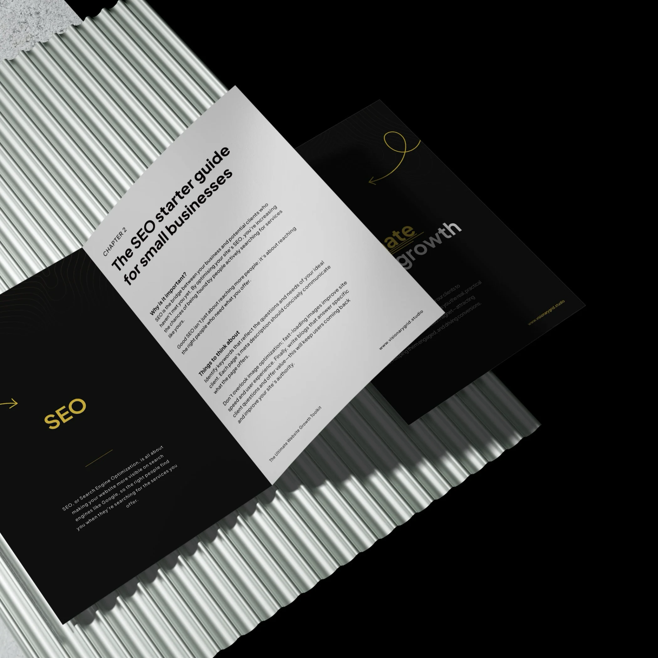
Grab our PDF toolkit to transform your website into a client magnet
Are visitors coming to your site but leaving too soon? This toolkit has everything you need to make your website a client-generating powerhouse, from boosting visibility on Google to creating an experience that keeps visitors engaged and ready to take action.
Inside, you’ll get insights on:
- Improving SEO so clients find you first
- Designing a smooth user experience to reduce drop-offs
- Crafting clear, engaging messages that build trust
Is your website costing you investors & customers?
Submit your site for a free Startup Website Stress Test.
We'll personally review your site and send you a 5-minute video breakdown of what’s working, what’s broken, and how to fix it—so you don’t lose opportunities.