The Top Website Design Mistakes Jersey Businesses Should Avoid
December 5, 2024
"Your website is your shop window—don’t let it turn customers away."
Your website should work as hard as you do. For businesses in Jersey, it’s often the first interaction someone has with your brand, so it needs to make an impact. Unfortunately, too many websites are riddled with mistakes that can cost sales and credibility. Let’s cut through the noise and highlight the key errors you can avoid to ensure your site works for, not against, you.
1. Neglecting Mobile Responsiveness
Over 60% of website visits now come from mobile devices. If your site doesn’t adapt to smaller screens, you’re waving goodbye to potential customers.
How to Address It:
- Test your site on various devices, from smartphones to tablets.
- Prioritise mobile-first design principles.
- Use responsive frameworks to ensure everything scales beautifully.
2. A Cluttered Homepage
Too much information on your homepage is like shouting over a crowd—nobody knows where to look.
Simplify It:
- Focus on one clear message or call to action.
- Use whitespace to give content room to breathe.
- Include only key elements: a strong headline, your value proposition, and intuitive navigation.
3. Slow Load Times
A sluggish website will frustrate visitors and drive them away. Even a second’s delay can have a measurable impact on conversions.
Speed It Up:
- Compress images without losing quality.
- Minimise unnecessary code and scripts.
- Use a content delivery network (CDN) for faster global access.
4. Weak Calls-to-Action (CTAs)
Your CTAs need to tell visitors exactly what to do next—vagueness won’t cut it.
Upgrade Your CTAs:
- Be specific: "Book Your Free Consultation" is better than "Learn More."
- Make them visually stand out with contrasting colours.
- Place CTAs in high-visibility areas, such as at the top of the page.
5. Ignoring SEO Basics
What’s the point of a beautifully designed website if no one can find it? SEO isn’t optional; it’s fundamental.
How to Get Started:
- Include relevant keywords naturally in headings and content.
- Optimise meta descriptions and image alt text.
- Regularly update your sitemap and submit it to search engines.
6. Poor Navigation
Confusing navigation frustrates users. If visitors can’t find what they need quickly, they’ll leave.
Streamline It:
- Keep menus simple with 5-7 clear options.
- Use descriptive labels like "Our Services" rather than vague terms.
- Add a search bar for easy access to content.
7. Over-the-Top Design
Just because you can add flashy animations doesn’t mean you should. Overly complex design can detract from usability.
Dial It Back:
- Stick to a cohesive colour scheme and limit fonts to two or three.
- Avoid unnecessary gimmicks.
- Focus on clean, functional design that serves the user.
8. Skipping Analytics
If you’re not tracking how your site is performing, you’re flying blind. Data is key to improving your website’s effectiveness.
Track These Metrics:
- Bounce rate: how quickly visitors leave.
- Average session duration: how long visitors stay.
- Conversion rate: how many visitors take action.
9. Generic Stock Photos
People can spot stock photos instantly, and they don’t build trust.
Do Better:
- Invest in professional, original photography.
- Use custom graphics or illustrations.
- Showcase real team members and genuine moments from your business.
10. Ignoring Accessibility
An inaccessible website excludes potential customers and risks legal issues. Accessibility isn’t optional.
Make Your Site Inclusive:
- Use alt text for images to support screen readers.
- Ensure keyboard navigation works throughout.
- Opt for high-contrast colour schemes for better readability.
11. Stale Content
Outdated content tells visitors you’re not paying attention, which can harm your credibility.
Keep It Fresh:
- Regularly update your blog with relevant posts.
- Replace outdated statistics or references.
- Keep visuals and design elements current.
12. Missing Social Proof
Potential customers want to know they can trust you. Testimonials, reviews, and case studies build that confidence.
Show Them You’re Worth It:
- Highlight client testimonials with photos or names.
- Share detailed case studies with measurable results.
- Link to external reviews on platforms like Google or Trustpilot.
13. Hard-to-Find Contact Information
If visitors have to dig around to get in touch, they won’t bother.
Make It Easy:
- Add your contact details to the footer of every page.
- Create a dedicated contact page with multiple ways to reach you.
- Ensure phone numbers and email addresses are clickable on mobile.
14. Dull, Uninspired Copy
Good design grabs attention, but great copy keeps it. Bland or generic text will lose your audience.
Write with Impact:
- Speak directly to your target audience.
- Highlight benefits over features.
- Use plain English and avoid jargon.
15. Not Knowing Your Audience
If your website tries to speak to everyone, it resonates with no one.
Know Your Customer:
- Understand their problems and needs.
- Use visuals and language they connect with.
- Tailor your messaging to show how you solve their issues.
Don't treat your site isn’t just a one-and-done brochure, instead think of it as a tool for attracting and converting customers. Your own 24-7 employee, lovely stuff.

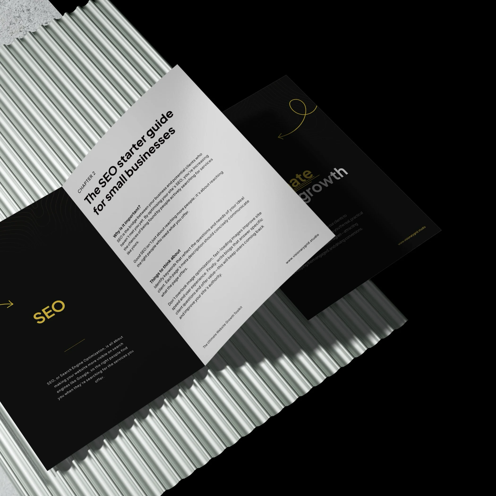
Grab our PDF toolkit to transform your website into a client magnet
Are visitors coming to your site but leaving too soon? This toolkit has everything you need to make your website a client-generating powerhouse, from boosting visibility on Google to creating an experience that keeps visitors engaged and ready to take action.
Inside, you’ll get insights on:
- Improving SEO so clients find you first
- Designing a smooth user experience to reduce drop-offs
- Crafting clear, engaging messages that build trust
Is your website costing you investors & customers?
Submit your site for a free Startup Website Stress Test.
We'll personally review your site and send you a 5-minute video breakdown of what’s working, what’s broken, and how to fix it—so you don’t lose opportunities.