I Studied 100+ of the World’s Best Websites—Here’s What They All Do in the First 3 Seconds
February 26, 2025
Most websites waste the first three seconds.
I’ve analysed over 100 of the world’s best-performing websites. SaaS, eCommerce, service-based businesses—you name it. And I noticed a pattern. The top-performing sites do three things almost instantly:
• Clear messaging (Who they help & how—without jargon)
• Trust signals above the fold (Case studies, credibility markers, social proof)
• A strong CTA designed for decision-makers (Not “Learn More” but “See How It Works” or “Book a Demo”)
Most SaaS websites? They skip this entirely.
They lead with features, not outcomes. They assume their buyers understand them. They don’t. They bury trust markers where no one sees them.
This is just one insight from the playbook I’m building. It’s almost ready. Want it early? Comment “Playbook” below.
But for now, let’s break down exactly what makes a website work—and how you can fix yours.
1. Clear Messaging: Say What You Do (Without the Jargon)
Bad example: “We leverage AI-driven solutions to optimise cross-functional workflows.”
What does that even mean?
Good example: “We help SaaS companies automate customer support with AI—so they close more deals, faster.”
See the difference?
How to Fix Your Website’s Messaging
• Speak your customer’s language. No jargon, no fluff—just clear, direct value.
• Focus on the outcome. What’s the transformation your product or service delivers?
• Keep it above the fold. If I have to scroll to understand what you do, you’ve already lost me.
2. Trust Signals: Show Proof Immediately
Your homepage isn’t the place to be humble. If a visitor is new to your brand, their first thought is: “Can I trust these people?”
The Best Websites Show Credibility Instantly
• Logos of trusted brands. If big names use your product, show them.
• Social proof. A short, powerful testimonial above the fold.
• Data points. Numbers build credibility fast (e.g., “Trusted by 10,000+ marketers”).
Most companies bury trust markers at the bottom of the page. By then? Your visitor is already gone.
3. Calls to Action (CTAs): Design for Decision-Makers
Most websites have weak CTAs. They use vague, low-commitment phrases like:
• “Learn More”
• “Get Started”
• “See Pricing”
The Best Websites Do This Instead:
• Use action-driven CTAs. (“See How It Works”, “Get Your Free Audit”, “Book a Demo”)
• Match the CTA to the buying stage. First-time visitors? Offer a free trial or case study. Ready-to-buy users? Give them a direct sales option.
• Make CTAs obvious. Don’t hide your main action button in a sea of text.
A weak CTA is the difference between a conversion and a lost visitor. Fix yours.
The Hidden Killers: 5 Common Website Mistakes (That Cost You Sales)
Even if you get messaging, trust signals, and CTAs right, these silent conversion killers can still wreck your site.
1. Slow Load Times
• Fix: Run your site through PageSpeed Insights. Aim for under 2 seconds.
2. No Mobile Optimisation
• Fix: Check how your site looks on a real phone (not just in a browser resize).
3. Too Many Choices
• Fix: Limit homepage options. More choices = more friction.
4. No Social Proof on Key Pages
• Fix: Place testimonials near CTAs, pricing, and checkout pages.
5. Weak Visual Hierarchy
• Fix: Use clear headings, whitespace, and bold CTAs to guide the eye.
The Simple Homepage Formula That Works Every Time
Want a high-converting homepage? Follow this structure:
1. Clear headline (Who you help & how)
2. Subheadline (Why it matters—what’s the outcome?)
3. Strong CTA (Action button that stands out)
4. Trust signals (Logos, testimonials, data points)
5. Visual proof (A short video demo, GIF, or key product screenshot)
This formula works for SaaS, agencies, and eCommerce alike.
The Playbook: Get Early Access
This is just one insight from the playbook I’m building. It’s a step-by-step guide to fixing your website, optimising conversions, and turning traffic into revenue.
It’s almost ready. Want it early?
Email hello@visionarygrid.studio “Playbook” and we'll get that sent over!
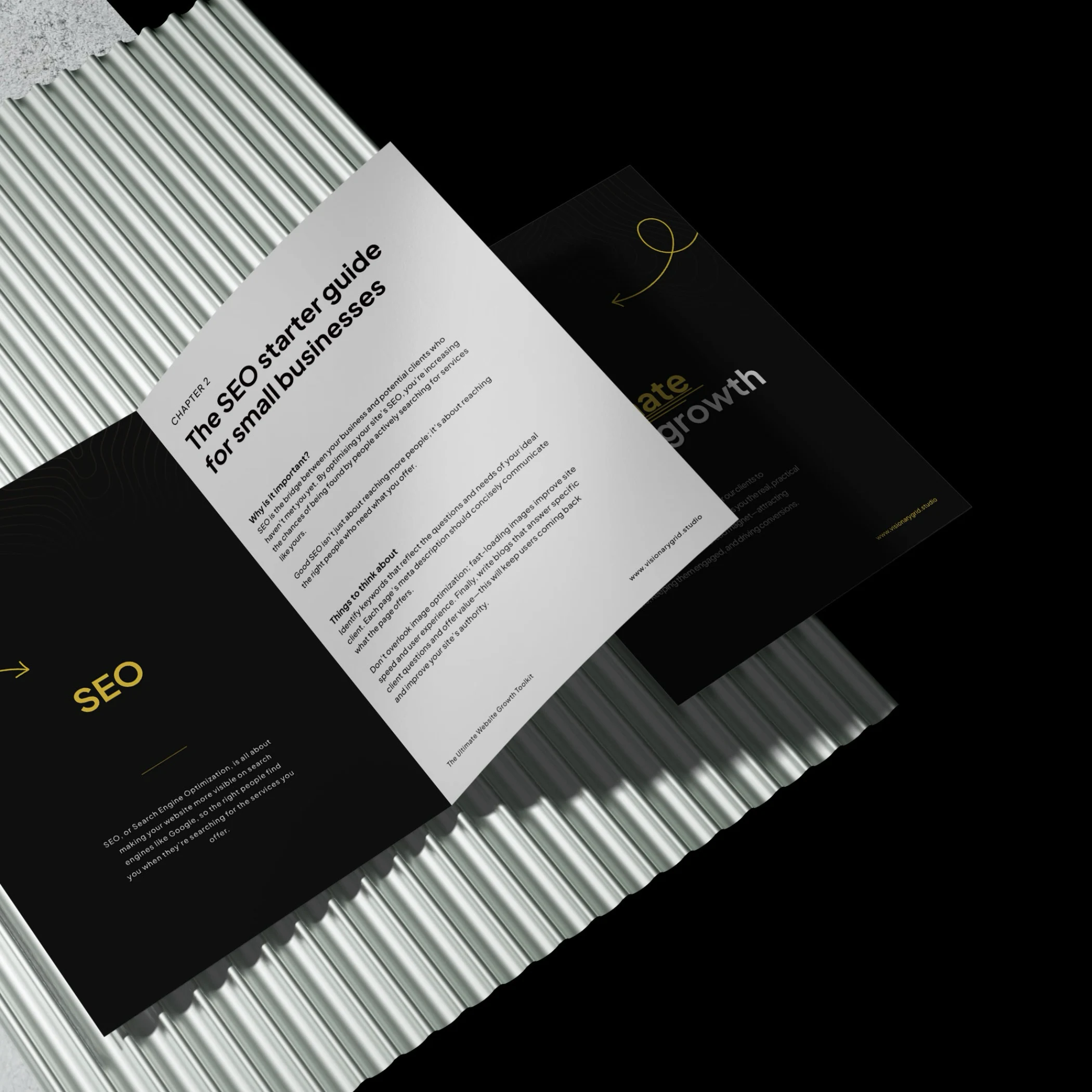
Grab our PDF toolkit to transform your website into a client magnet
Are visitors coming to your site but leaving too soon? This toolkit has everything you need to make your website a client-generating powerhouse, from boosting visibility on Google to creating an experience that keeps visitors engaged and ready to take action.
Inside, you’ll get insights on:
- Improving SEO so clients find you first
- Designing a smooth user experience to reduce drop-offs
- Crafting clear, engaging messages that build trust
Is your website costing you investors & customers?
Submit your site for a free Startup Website Stress Test.
We'll personally review your site and send you a 5-minute video breakdown of what’s working, what’s broken, and how to fix it—so you don’t lose opportunities.