How to Style Form Elements: Tips and Best Practices for Accessibility and Design
October 29, 2024
Forms are more than just a set of input fields on a webpage—they’re an essential part of user experience, often serving as the main point of interaction between a business and its audience. Well-designed, accessible forms can make filling out a form feel smooth and easy, while poor design can lead to user frustration and drop-offs. Below are tips and best practices on styling form elements that prioritise user experience, accessibility, and visual appeal.
1. Start with clear labels
Why it’s important
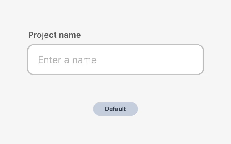
Labels guide users on what information is required in each field. Without clear labels, users can quickly become confused, leading to errors or form abandonment.
Best practice
Always place labels directly above or beside the input field, so it’s immediately clear what’s needed. For accessibility, link the label to the form field by using the <label for> attribute in HTML. Avoid placeholder-only labels, as they disappear when the user starts typing, which can be confusing. For example:
<label for="email">Email Address</label>
<input type="email" id="email" name="email">
2. Use descriptive Placeholder text (but sparingly!)
Why it’s important
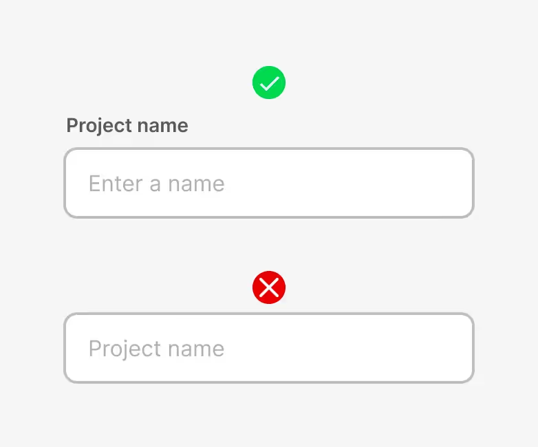
Placeholders provide extra hints, but if used as the main label, they can fade when users type, leading to potential confusion.
Best practice
Use placeholder text sparingly for additional hints, not as a replacement for labels. Keep the placeholder short and clear—think “e.g., user@domain.com” rather than a full sentence. Placeholder text should have enough contrast to be readable but not compete with the actual input.

3. Ensure high contrast for readability
Why it’s important
Low-contrast text can be difficult to read, especially for users with visual impairments.
Best practice
Aim for a contrast ratio of at least 4.5:1 between text and background. This ensures readability for users in various lighting conditions and for those with visual impairments. Tools like WebAIM’s Contrast Checker can help verify contrast levels.
4. Use accessible error messaging
Why it’s important
Users need to know when they’ve made an error and how to correct it without confusion.
Best practice
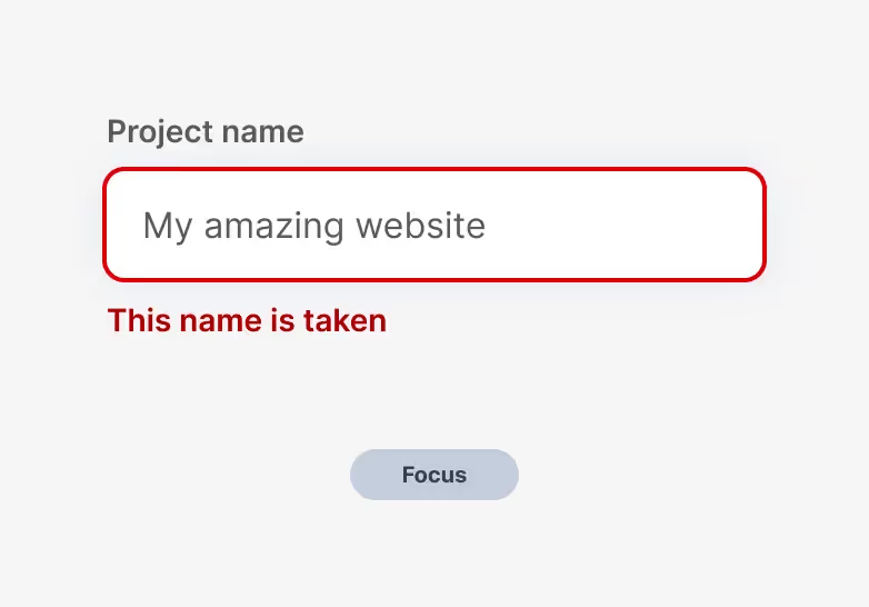
When an error occurs, display a clear, specific message directly below or next to the affected field. Use colour (e.g., red for errors) in combination with icons or text to meet accessibility needs for colour-blind users. Ensure error messages are readable by screen readers by using the aria-live attribute:
<div aria-live="assertive" class="error-message">Please enter a valid email address.</div>
5. Make fields big enough for touchscreens
Why it’s important
With the rise in mobile browsing, fields that are too small can be hard to tap, leading to user frustration.
Best practice
Make sure each form field is at least 44x44 pixels, as recommended by Apple’s Human Interface Guidelines. Provide enough spacing between fields to prevent accidental taps, and ensure buttons like “Submit” or “Next” are large enough to be tapped easily.
6. Use a logical layout
Why it’s important
A clear layout makes filling out forms faster and more intuitive.
Best practice
Arrange form fields in a single column rather than multiple columns. This layout minimises eye movement and makes it easier for users to focus on one field at a time. For longer forms, consider grouping related fields with headers or fieldsets to make the form feel more manageable.
7. Add tooltips for complex fields
Why it’s important
Certain fields (like those for password creation or document uploads) can be confusing without additional guidance.
Best practice
Use tooltips (small icons with “?” or “i” symbols) next to these fields to offer extra guidance without cluttering the form. Ensure the tooltips are keyboard-accessible and don’t disappear too quickly.
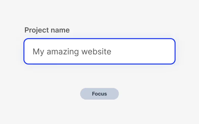
8. Provide visual feedback on focus
Why it’s important
Visual feedback on focus helps users know where they are in the form, which is especially helpful for those navigating via keyboard.
Best practice
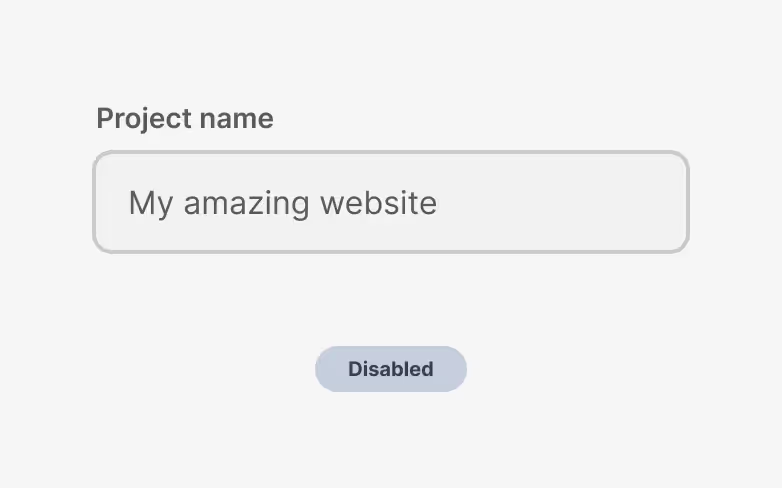
Highlight the active field with a clear visual indicator, such as a border or shadow. Make sure this style contrasts with the background and stands out. Avoid removing the browser’s default focus style unless replacing it with a more prominent one.
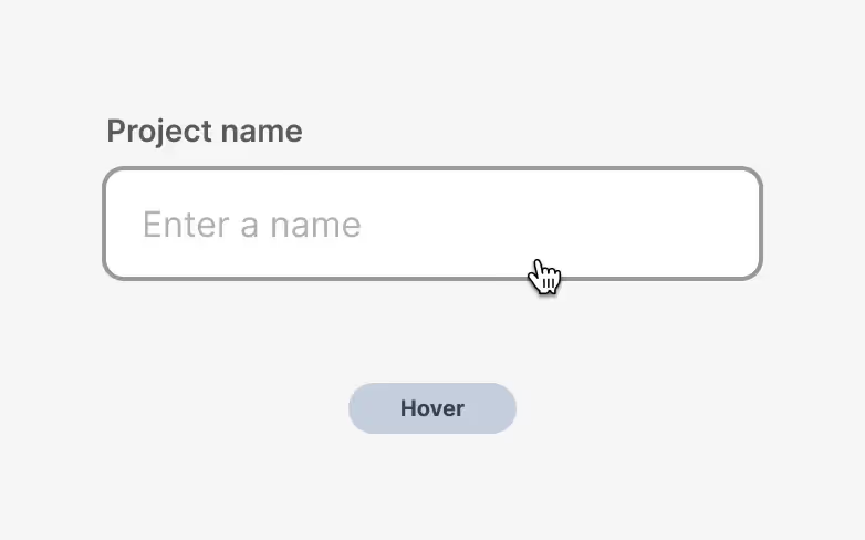
9. Simplify form submission
Why it’s important
Users should be able to submit forms easily, without unnecessary steps.
Best practice
Place a single “Submit” or “Send” button at the end of the form. Use a button that’s clearly styled as clickable (e.g., coloured with hover effects). Make sure it’s large enough for mobile users and clearly states the action, like “Sign Up” or “Get Started.” Also, include a “Loading” animation or message to confirm submission on click.
10. Optimise for autocomplete
Why it’s important
Autocomplete saves users time by suggesting previously entered information.
Best practice
Enable autocomplete in fields like “name,” “email,” and “address” by using appropriate HTML attributes. This is especially helpful on mobile, where typing is more cumbersome.
<input type="text" name="name" autocomplete="name">
<input type="email" name="email" autocomplete="email">
11. Provide a Clear Call to Action (CTA)
Why it’s important
A strong CTA encourages users to complete the form.
Best practice
Use a button with a clear, action-oriented label, such as “Get Your Free Guide” or “Sign Up Now.” Avoid generic CTAs like “Submit.” Make the button visually distinct with a bold colour that contrasts with the form’s background.
12. Use inline validation (But carefully)
Why it’s important
Inline validation (real-time feedback) can help users spot errors as they type, making corrections easier.
Best practice
Use inline validation to guide users, but make sure it’s not too intrusive. Confirm correct inputs with a small checkmark and highlight errors only after the user moves to the next field.
Styling form elements goes beyond aesthetics; it’s about creating a seamless, accessible experience that builds trust with your audience. By following these best practices, you can improve the usability, accessibility, and overall effectiveness of your forms, resulting in a better experience for users and higher conversion rates for your business.
Start with the Client Acquisition Diagnostic
Before you redesign anything, find out what’s actually happening after someone lands on your site.
This diagnostic benchmarks whether clarity, structure, or compounding is the bottleneck—and shows you what to fix first so you stop guessing.
It identifies:
- whether your core offer is understood without a live explanation
- whether there’s a clear next step (or just “book a call”)
- what happens when a ready prospect lands on your site
- where interest stalls because the journey isn’t structured
- whether you can see what’s driving qualified leads → appointments
You’ll get a score and a breakdown showing what’s limiting qualified leads—and what to change next.