8 Steps to Create High-Converting Lead Generation Pages
November 4, 2024
Want to turn visitors into leads? I’ll show you the steps to design and optimise lead generation pages that work.
What makes a lead generation page work?
A lead generation page’s goal is simple: get your visitors to take action. It could be signing up for a newsletter, downloading a guide, or requesting a quote. But just having a page doesn’t mean people will convert. It has to be effective, clear, and easy to use. Below, I’ll walk you through the top strategies that make a lead generation page actually work.
1. Know Your Audience
Why Audience Matters for Conversion
Before you start designing, you need to understand who your audience is. Think about what they need, what they struggle with, and what would drive them to take action.
Action tip: Write down key qualities about your audience—what’s their main pain point? What’s the easiest way to solve it for them?
2. Have a Clear, Eye-Catching Headline
Why a Good Headline Matters
Your headline is the first thing people see, and it needs to grab attention. Make it benefit-focused and concise. People should instantly understand what they’re getting.
Action tip: Use headlines like “Boost Your Sales in 10 Days” or “Get Your Free Guide to [Industry Topic]” – simple and clear.
3. Explain the Benefits Quickly
What’s in it for Your Visitors?
Visitors need to know why they should give you their information. List out the benefits they’ll gain. Avoid jargon, and keep it short and clear.
Action tip: Bullet points work well for benefits. Focus on what they’ll get by signing up or downloading.
4. Keep the Design Clean and Simple
Clutter-Free = High Conversion
Avoid overwhelming your visitors with too much on the page. A cluttered design distracts people from your call to action (CTA). Keep your design clean, with plenty of white space around elements.
Action tip: Only include essential elements—your headline, benefits, an image, and a call to action button.
5. Place a Strong Call-to-Action Button
How to Create a CTA That Works
A strong CTA button can make all the difference. Use action-oriented words and make it stand out. Don’t use “Submit” or “Click Here.” Instead, try phrases like “Get Started,” “Download Free Guide,” or “Access Now.”
Action tip: Make your CTA button a different colour from the rest of the page, and make sure it’s large enough to see easily.
6. Use Visuals Wisely
Images That Support Your Message
Good visuals can boost your conversion rate. Use images or graphics that show what visitors will get, like a picture of your downloadable guide or a happy customer. Avoid using generic stock photos that don’t add to your message.
Action tip: Use custom images or graphics when possible, as they add authenticity to your page.
7. Add Social Proof
How Testimonials and Reviews Help Convert
People trust other people’s opinions. Adding testimonials or reviews can help show visitors that others found your offer useful. If you’ve got any awards, certifications, or well-known clients, include them too.
Action tip: Use one or two short testimonials, ideally with a name and photo of the person if possible.
8. Make Your Form Simple
Only Ask for What You Need
If you’re using a form, don’t overdo it. The fewer fields you have, the better your conversion rate will be. Only ask for essential information, like their name and email. Asking for too much can feel overwhelming and drive people away.
Action tip: Start with just one or two fields in your form. You can always ask for more information later in the process.
9. Optimise for Mobile
Ensure a Smooth Experience on All Devices
Many people will visit your page from their phones, so make sure it looks and works well on mobile. Test your page to see if it’s easy to navigate and if the CTA button is visible without too much scrolling.
Action tip: Check your page on multiple devices and make sure the CTA button is easy to click on a small screen.
10. Keep Testing and Improving
The Power of A/B Testing for Higher Conversions
Sometimes small changes can make a big difference. Try out different headlines, colours for your CTA button, or even the placement of elements. Testing helps you find what works best for your audience.
Action tip: Use A/B testing tools to see which versions of your page perform better, and make changes based on data, not guesswork.
Final Thoughts on High-Converting Lead Generation Pages
Building a high-converting lead generation page doesn’t have to be complex. By focusing on simplicity, a clear value offer, and testing, you can create a page that turns visitors into leads. Remember: the goal is to make it easy for visitors to see the value and take action.
For more tips on creating powerful, conversion-driven websites, feel free to reach out—I’d be happy to help you build a page that works for your business.

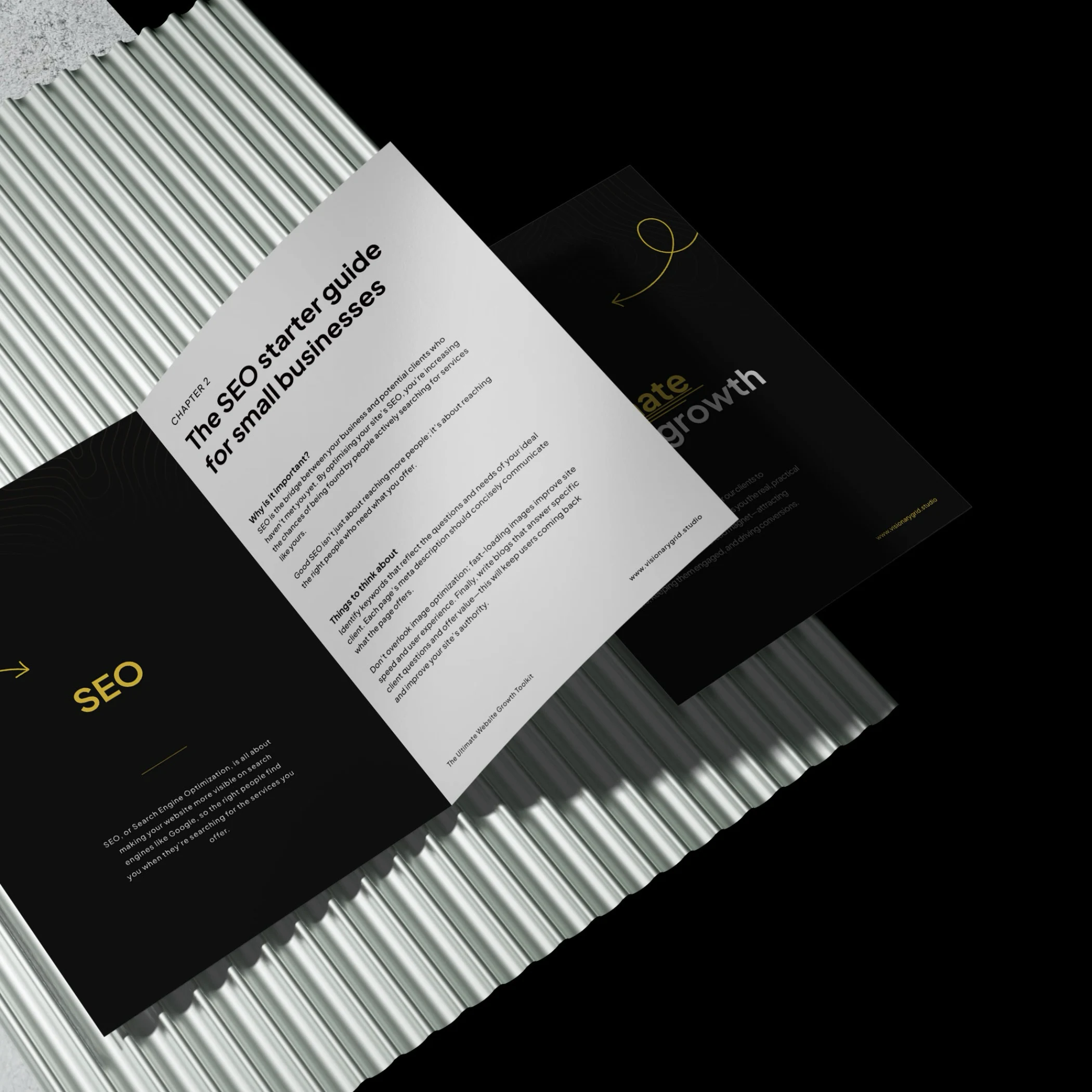
Grab our PDF toolkit to transform your website into a client magnet
Are visitors coming to your site but leaving too soon? This toolkit has everything you need to make your website a client-generating powerhouse, from boosting visibility on Google to creating an experience that keeps visitors engaged and ready to take action.
Inside, you’ll get insights on:
- Improving SEO so clients find you first
- Designing a smooth user experience to reduce drop-offs
- Crafting clear, engaging messages that build trust
Is your website costing you investors & customers?
Submit your site for a free Startup Website Stress Test.
We'll personally review your site and send you a 5-minute video breakdown of what’s working, what’s broken, and how to fix it—so you don’t lose opportunities.