6 Simple Website Design Errors You Shouldn't Be Making!
August 9, 2023
If your livelihood depended on making a good impression with passers-by, you’d make sure your shop/office/stall was as beautiful as possible, right? You’d make sure it was clean, easy to use, and an all-round pleasure to use. So why would your digital output be any different?
Having a well-designed website is just as important for success. However, it's easy to make mistakes when it comes to web design. Some can be pretty minor, however, some can have a massive impact on your site's usability, user experience, and overall effectiveness. Here are 6 of the most common mistakes I see regularly.
1. A cluttered and busy layout
Something I see all the time is cramming too much information onto a single page. A cluttered layout overwhelms visitors and makes it difficult for them to find what they're looking for. This is the web, it’s not a print brochure. We’ve got more room to breathe!
Crucially, it’s important to prioritise essential elements and use whitespace effectively. What are your customers likely to want to do on this page? Maintain a clear visual hierarchy that guides them seamlessly through your website and navigates them to where they’re wanting to go. Less is more when it comes to websites.
2. Inconsistent branding
Your website should reflect your brand identity. Ultimately, this is the face you put out into the world! If you’re using inconsistent fonts, colours, and imagery it can confuse visitors and diminish your brand's credibility. Make sure to establish a visual style guide that covers all aspects of your site's design and maintains consistency across all pages.
By going that extra step and crafting a design system for your brand, you’re not only ensuring consistency, but you’re also saving time and money by being more efficient in future projects. Get in touch if you think a design system is right for your brand.
3. Poor navigation
Navigation is the backbone of any website. The web isn’t new and exciting anymore, if your users have trouble finding the information they need, they’re not going to stick around. Avoid overly complex menus or hidden navigation elements. Make sure your navigation is intuitive, with clear labels and logically organised sections. Don’t be too creative or ‘fun’ with page names. Just because you know what “The Squad” is, doesn’t mean your customers will. Play it safe with your navigation, be creative elsewhere.
4. Lack of mobile optimisation
During the first quarter of 2023, almost 50% of web traffic was from a mobile device. For those of you good at maths, that’s half. Half of the traffic comes from a mobile device, that’s a lot. Imagine if you turned away half of your customers from our hypothetical shop/office/stall. If your website isn't responsive or fails to adapt to different screen sizes, those mobile users will just leave. Plus Google much prefers your site if it plays nicely on all devices. It’s best not to upset Google. Ensure your site is mobile-friendly by adopting a responsive design that adjusts seamlessly across various devices.
5. Slow load times
To put it politely, we’re easily distracted. Users expect your website to load quickly. Slow page load times are a major turn-off and can lead to high bounce rates. Optimise your images, make sure they’re relatively small in size and use the correct format. Even better, use more modern web format styles like WebP to ensure your website images load quickly and efficiently. Minimise the use of bulky scripts or plugins that can significantly delay loading times. Unless you need a plugin like this, it’s best to leave them out.
6. Lack of call-to-actions
Last, but certainly not least, is the lack of call-to-actions, or, if you’re looking to save time, a CTA. A website without a clear CTA is unlikely to perform, at all. This is arguably one of the most important bits on your site, this is the main thing we’re trying to get users to click on and interact with. Whether it's prompting users to make a purchase, subscribe to a newsletter, or contact you, an effective CTA guides visitors towards the desired action. Place your CTAs strategically, make them visually appealing, and use concise, compelling language to encourage engagement. Short punchy copy is always stronger and more efficient.

That’s it! Easy right? Avoiding these six common mistakes will go a long way to ensuring your website is performing at its best. Keep your site clean, clear and concise and make sure it works well across all devices. If you’re unsure and need a hand, I can provide a website audit of your site and highlight issues that may be holding your website back.

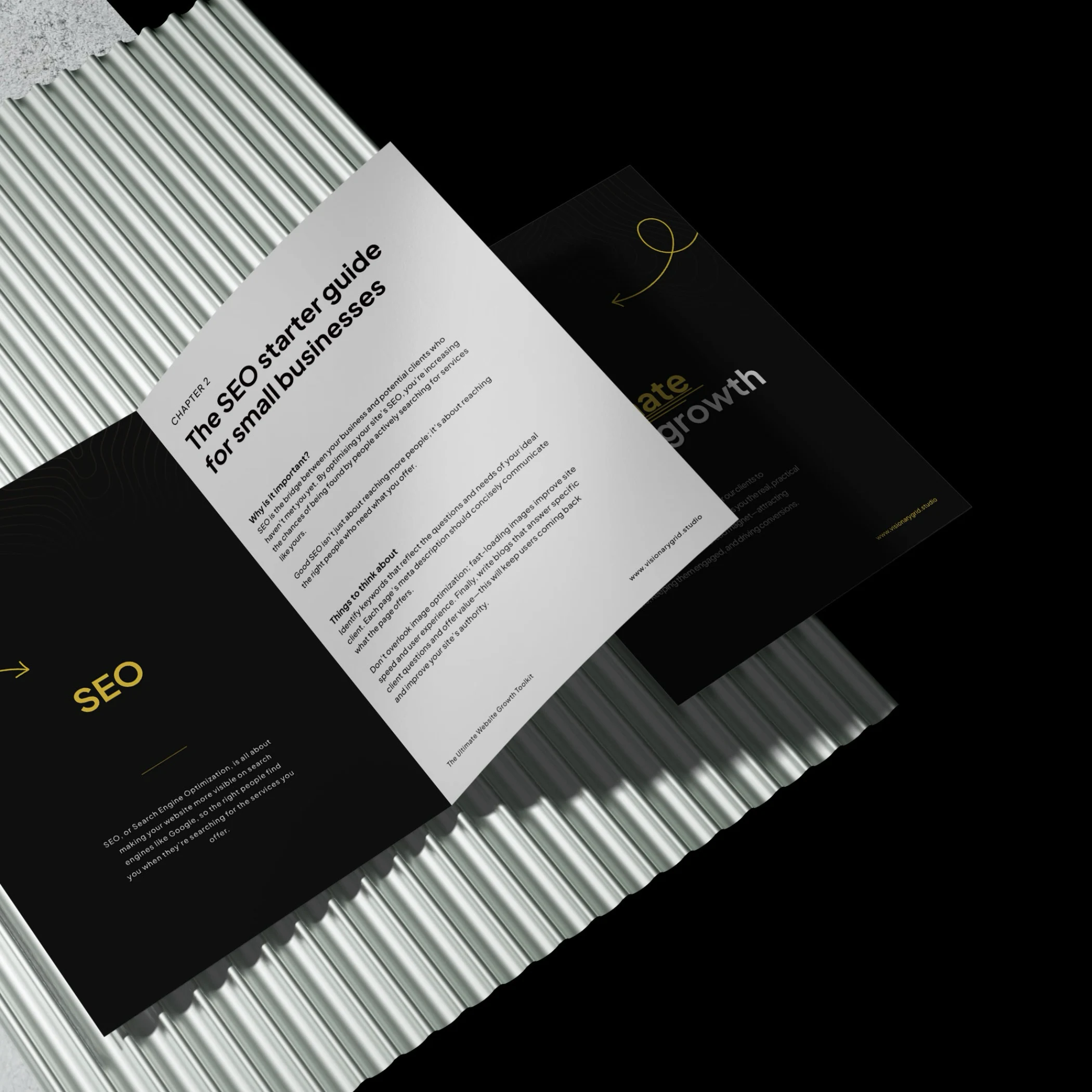
Grab our PDF toolkit to transform your website into a client magnet
Are visitors coming to your site but leaving too soon? This toolkit has everything you need to make your website a client-generating powerhouse, from boosting visibility on Google to creating an experience that keeps visitors engaged and ready to take action.
Inside, you’ll get insights on:
- Improving SEO so clients find you first
- Designing a smooth user experience to reduce drop-offs
- Crafting clear, engaging messages that build trust
Is your website costing you investors & customers?
Submit your site for a free Startup Website Stress Test.
We'll personally review your site and send you a 5-minute video breakdown of what’s working, what’s broken, and how to fix it—so you don’t lose opportunities.